Times are changing. 2020 statistics prove that you can lose the majority of your customers from just bad website design. In the face of rapid digital consumption, your website works as your brand. The cost of losing customers outweighs the cost of a well designed website.
Table of Contents
Design is not just what it looks like and feels like. Design is how it works.
– Steve Jobs
The thing about design first and foremost is that it’s commonly misunderstood as a “look only” concept. I’m sure you’ve heard of people repeating the words “look and feel”, which is a pretty popular phrase for describing how a product or a piece of work makes you feel.
Design is not just about looks. It’s about usability and function
That doesn’t even cover the gist of it. Web design applies to your sitemaps, structure of sections, placement of content, graphic design, images, coding, SEO, sales funnels, contact forms, hyperlinks, typography, etc. These are direct powerhouse techniques that usher your audiences to you.
How are we so confident that web design is that important? Well, don’t take our word for it. Recent statisticsprove that you can lose the majority of your customers just from bad web design alone.
1
Over 73% of consumers judge business credibility by website design
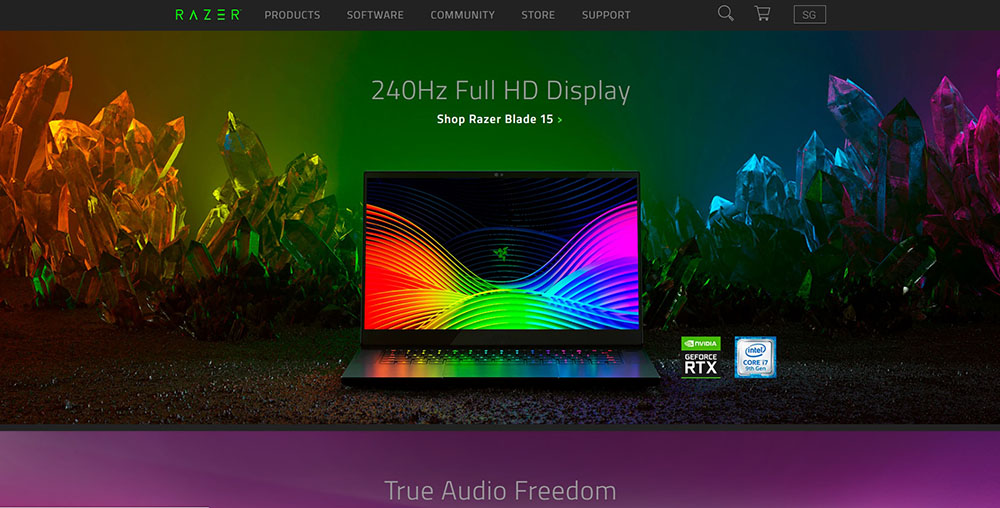
What’s the first thing that grabs your attention when you enter a website? Design. That could be the design of the words, hero banner images or the calls to action. Let’s look at this crystal clear (pun intended!) web design that Razer has.
Razer, 2020. The design is outstanding, crisp and leaves a lasting impression of capabilities
When a website looks plain and empty, or when it’s difficult to navigate, the first impression we get as viewers is that it isn’t professional. For comparison, we look at another website that offers similar products and specialisations.
I have no idea what I’m looking at until I read the text, which is hard given how cluttered and cramped this is. It gives a ‘dusty’, abandoned impression
The design just tells me – they’re not even putting in effort to invest in a good website, they don’t care, they’re outdated and they don’t understand how to attract customers. Why would I trust their services?
2
Due to this, 94% of users will leave a badly designed website
This might seem like a gross exaggeration, but it isn’t. People like to say, “Never trust a book by its cover.” But as humans, it’s always going to be part of our nature. Which of the above two examples of websites would you purchase a computer from?
If the cover of a book looks uninteresting, with a boring title, would you pick it up? If your food looks unappetising, like someone sneezed mucus all over it, would you eat it?
To complete the analogy, there are a dozen other food stalls in the food court and rows of bookshelves in the library. Similarly, when searching online, users have been known to open multiple tabs while conducting online searches.
There's a sea of competitors online providing their content on many different media. First thing that people decide to stay for is design
Your users are going to have a dozen other tabs open to find the best service provider for their needs. And if your website looks bad, and requires great effort to understand and find information, your customers will abandon you for your competition.
3
More than 90% of unsatisfied feedback about websites are design related
Online customers want things fast and easy to understand, especially in a highly developed first-world network of 4G and fibre optics. This is where web designers need to account for human behaviour and user patterns. We need to look at web design from the outside in, from the way customers browse it.
Web design should aim to keep users and customers in mind. This would reduce a majority of unsatisfied user feedback
One way of doing this is to personalise and humanise websites so that people not only find the experience easy and quick, but also enjoyable. Check out our post on more horrible designs we’ve seen and strategies to improve user experience!
4
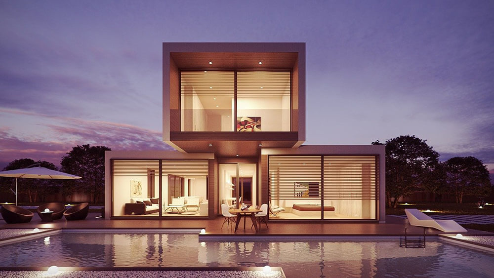
Users take 0.05 seconds to think about staying or leaving your website
Yes, that’s just how quickly your website can lose or gain traffic. Again, we can see from here that the appearance of design is the first thing that grips attention on a website. What’s your first impression of the house below? Do you notice the design of the architecture first or the contents inside/around it?
How your website looks is the first thing that grips attention. The details and content within come after
For more website-oriented examples, have a look above and below at our comparisons between websites with great design and those with weak design!
Of course, content plays a part in affecting your users’ choice by engaging their reading experience and perspective. However, no matter how good your content is, with bad design, the majority of your visitors will instinctively leave for another website, almost immediately.
5
59% of users view beautifully designed content than something flat and plain
This is just self-explanatory. Compare these two websites. They provide similar services and content. One has modern visuals and the other doesn’t. Which would you choose to read? Why?
Dream Fox Design, 2020. A website in the works. Beautifully designed content is more compelling to read and gets majority of viewership
Plain design that relies on dated themes and colours doesn’t relate well to younger audiences and customers - the main bulk of Internet users
6
Users look at images and infographics longer than written content
Readers find that websites with design that supports the content, especially images and infographics, are much easier to digest than a whole essay of words.
Instead of just using text, use a mix of text, infographics and illustrations that support one another. It makes your website more interesting
If these illustrations convey the same meaning as your content or support your message, then it makes sense that online customers will prefer fantastic visuals over words.
This does not mean content writing isn’t important. Design wins attention; writing style gives perspective and engages users by guiding them across your website, letting them know how to take action. It’s as much a part of your brand as your design.
Without written content, there’s a deadline to how long illustrations can hold attention.
7
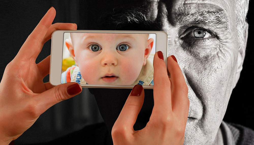
Readers understand content 323% better with matching illustrations
It goes without saying that your illustrations should match your content. It just confuses readers when you’re writing about nursing homes and your illustrations are about babies, doesn’t it?
Consistency between your illustrations and content strengthens understanding. Inconsistency makes your website less relevant, more confusing
While many businesses and programming-focused web developers may overlook this, there’s a difference between design and decoration. Design is not meant to just look nice; design is meant to function with your content and objectives.
If a picture is worth a thousand words, design should convey your brand style, brand image, brand positioning and even brand attitudes. In our experience, this highly personalises your website consistently with your content, driving up the quality of consumers legitimately interested in what you offer.
8
They remember 65% of information with matching illustrations
As compared to only 10% when information is presented without illustration! Illustrations and design are often part of a bigger message, used to complement or give symbolic, emotional meaning to written content.
For example, having your brand logo or a catchy picture clearly depicted on your website serves as both a strong reference point for memory and a strong reminder of your content when readers see it again.
Coca Cola, 2020. Association with your logo, pictures and themes makes your content much more memorable
Memory works better with symbolic or emotional association, because often it’s the immediate appeal of your brand that matters more to online customers whose habits are to make judgment calls after their first impressions.
9
As a result, traffic on your website can scale up by 12% with infographics
Consider this a glimpse of the potential your website can achieve with superb and relevant design, including infographics and other types of images.
Professional and user-first web design undoubtedly boosts traffic and sales on your website. This we guarantee
More traffic means more viewers and time spent on your website. That means more customers and more SEO because Google would love you for it. More SEO means more publicity on search engines, which goes full circle to even more traffic. Want other ways to get more traffic on your website? We list our methods here!
10
73% of companies are investing in design to brand themselves
There’s a reason why so many companies are investing in design, and we’ve listed plenty. Businesses which prioritise design are 1.5 times more likely to exceed business goals. Are you one of them?
Web design makes your business relevant in this day and age. Statiscally, creativity and design bring high returns
Times and customers are changing. In the face of rapid digital consumption, your Website is your Brand. The cost of losing customers outweighs the cost of a well designed website.