

Websites, landing pages, videos – they’re being consumed on the go – buses, cars, trains, everywhere. In the exact instance your consumer is at a traffic junction, that’s where an opportunity to show your content lies.
By being aware of the design trends that emerge and become popular, we can understand why they matter and why they are so effective for businesses. At its core, the goal of web design and development is to reach, communicate and engage viewers.
That said, the preferences and demands of your audience change with every era; design trends are based on our understanding of what people want to see and how they decide to purchase a product or service from your website.
From a psychological standpoint, design trends in 2019 and 2020 reflect the low attention spans of online users. Without adapting design to site loading speed or gripping styles, your message can easily be skimmed over.
In this article, we talk about what layouts, design styles, fonts, animations and colours fit the unique experience of powerful and trendy 2020 web designs for your audience today. After reading, you’ll be able to apply them to your websites or talk to your designers about it.
3D Illustration
3D visuals are coming in harder than ever in a digital age where every brand is trying to stand out from one another and grab attention. This has been achieved with virtual reality augmentation which has boomed into a digital trend in games. As a proven formula for success in design, this is a solid trend for web design to follow.
Web designs have now increased more realism, depth and boundary-breaking opticals to make their graphics pop. This call for more 3D qualities in web designs indicates a desire by the audience to be immersed in the content. Immersion involves interacting with the elements through your screen, such as scrolling down a website or clicking on certain graphics to bring about an effect. Take a look at Smash Mallow’s website, for example.

3D illustrations are also emerging in the form of social media posts, especially Facebook’s 3D photo capability. Find out how to create 3D posts on Facebook here!
Helveticization of Brands
If you look around, you’ll see many high-profile brands transforming their logos and brand identity into a more mature, solemn version of themselves.

This is a phenomenon commonly known as Helveticization. Why? Simply because Helvetica is a choice font style for many businesses and brands to signal their transitions into maturity.
Popular examples include Uber, Marketo and Mailchimp.

Since Helvetica is a popular type font that’s used in many typography works, it fits into people’s comfort and familiarity with it. A classic type font, it’s not only universal in application within any industry or medium, but a deliberate evolution of a company’s image.

What’s the best platform on which this evolution can be featured? Your website, of course. That’s literally the easiest entry of access for anyone who wants to know more about your brand.
Wild, Abstract Design Styles
Another fast rising trend is the use of abstract and surreal designs on websites. Viewers respond to flamboyant colours, fun images and unusual sights.
This can range from sketches styled by lines or completely illustrated works for all business and brands. Abstract designs give designers and companies more room to customise and be flexible with their creativity.
This helps to create a fun, light yet professional feel for projects that are more artistic and quirkier in nature. Furthermore, to illustrate a concept rather than a quantifiable product, a design with no defined structure is far more suited to evoke feelings and emote symbolism.
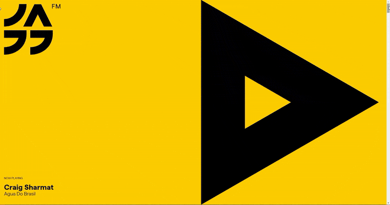
Take a scroll through Jazzfm’s website to see how they construct the imagery of their musical aesthetics through their Picasso-like cubist art style.
There is a reason why art and beauty are appreciated in every culture. They’re all vibrantly colourful and focus on intuitive experiences without enforcing a perimeter.
As web designers, we say this works thoroughly well to convey abstract ideas and a fun, appealing sense of personality to your viewers. However, our critical analysis is that design styles like this would only be confusing and offbeat for a purchasable product / service that’s associated with a well-known brand style.
Opposites in Colour Uses
In web design, or any sort of design at all, the best colour palettes have a specific consistency in order to bring about a clear message. Companies often use two polar opposites in colour themes: soft and bold designs.
Soft designs encompass mellow and friendly colours that are inconspicuous.

Conversely, bold designs comprise attention-holding, heavy colours that busily insert themselves into the viewer’s impression.
In our experience, colour usage relies heavily on psychology. Strong colours such as black, red and orange depict excitement, boldness and energy. Pastel colours such as light blue, pale grey or pale lemon generally give a feeling of softness, calmness and peace.
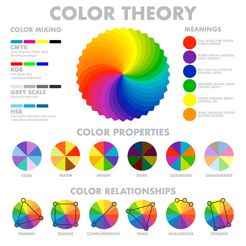
So, which end of the trend should you follow? Depending on your brand style and brand guideline, you should pick a colour theme that best illustrates your brand’s attitude and stick to those colours consistently. This enforces a strong sense of association and focus among your consumers.
The Era Of Content
Design is the art of storytelling, whether it’s for your business or for a website. Designers put images, graphics and themes together to make a narrative about the content they are selling. But like it or not, design cannot survive without proper perspective.
Nike has an entire website dedicated to its ‘About Us’ content that breaks down branding and marketing into its raw cause: Inspiration to everyone who can be an athlete.

Perspective presents your brand in the way you want people to see and love it. That’s where content comes in. As Jeffrey Zeldman famously tweeted, “Design in the absence of content is not design, it’s decoration.”
Without the colours, designs and motion effects, a website is mostly made up of words. These words matter in any design. Writing content for your customers is like trying to impress a date. You don’t want to be too chatty or too quiet; you want to find the right conversation and words to win a second date.

Content also acts as a way of structuring and building user experience navigation that flows seamlessly and compellingly from one webpage to another.
This involves the use of calls to action, professional language, user-friendly writing styles that sustains attention and curiosity. Content is a part of experience on a website and critically contributes to sales funnels.

Take a look at the writing styles above. Less business fluff, more simple, genuine language. For a new generation of consumers who are growing to look for fulfilment, credibility and meaning, the sincerity and heart of your content is what brings engagement to your business. This goes without saying, but be professional and business-y where it counts.
Motion Effects
Motion design can be a great asset to web design when it breathes life into your website. Why? It’s a competitive and powerful tool that lots of websites rely on to make content lively and thrilling to read. And it will likely evolve to become even flashier, more dynamic and interactive to engage users further.

The other purpose of motion design is to usher or direct your traffic across your website, from one section to another, for example.
Apple’s airpod section of its website has one of the best motion effects we’ve seen. As you scroll down the website, the subjects in the images move according to how much you scroll. Their fluidity of motion is smooth and instantly holds attention.

Too much motion graphics and effects can backfire on you as well. Just as much as they can attract attention and distinguish your website from competition, they can ultimately cause distractions and confusion.
This may frustrate your viewers, and potential customers could leave the website. Worse still, the flashiness and rapid flickering in motion design could be life-threatening to individuals with medical conditions such as epilepsy.
The line between delivering impact from your website and harming others unintentionally in this way can be quite blurred. It’s best to use animations and motion effects sparingly. Whenever you decide to use strong dynamic animations, make sure it has a purpose, like directing a user’s attention to the CTA.
Remember, web design is meant to reach, communicate and engage viewers. Be mindful of your aims when designing your website. Feel free to contact us for a free consultation before starting any web project!
Bigger and Bolder Fonts
Designing text on websites takes a level of understanding how viewers process information and how you want to command their attention. By increasing the font size of your content to a bold and large appearance, you’re essentially making it the centre of your design.

What this does is focuses attention on the textual aspect of your website, so the need to use other more pictorial design elements are lessened. As the text can be rendered so huge, viewers would have to consume the content in parts, not full sentences.
This allows the designer to highlight or emphasise certain important messages that may not otherwise pop and get the same level of awareness from a viewer. From a minimalist standpoint, this less-is-more approach ensures instant and effective attention to your words.
Depending on your website’s objectives, this pattern of designing text can also be applied to creative navigation menus and your call to action (CTA) buttons to inevitably force attention towards them.

Personally and professionally, we wouldn’t advocate too much of this design trait unless your website has a special theme, objective or a preferred manner of presenting information. Even then, having this on every webpage is not advised.
Content should be written in a viewer-friendly fashion without compromising readability for overly large personalities, i.e. fonts. The in-your-face concentration of large, bold fonts can be off-putting and overwhelming for visitors.
Animated Cursor Designs
The cursor is what allows your viewer to physically interact with your website. It’s the undeniable nexus of online dynamics between human and digital. Many websites and companies overlook this design, yet a customised cursor design and animation adds an integral layer of interaction, branding and opportunities to impress.
Toonami’s website shows off their interactivity by swinging the perspective of their pages and adding a glitch rollover effect as your cursor hovers across the page.

Erratic Scroll Transitions
As you’re scrolling through a page, there are typically multiple sections or screens that represent a part of the page you’re looking at. That’s where transitions come in. Is it a line or a plain, simple block that separates one section from the next?
A trending application of transitions is using a visual element that is both attention-grabbing and adds to the value of the page. Transition thus becomes much more fluid and distinctive in helping your story segue from one section to another.
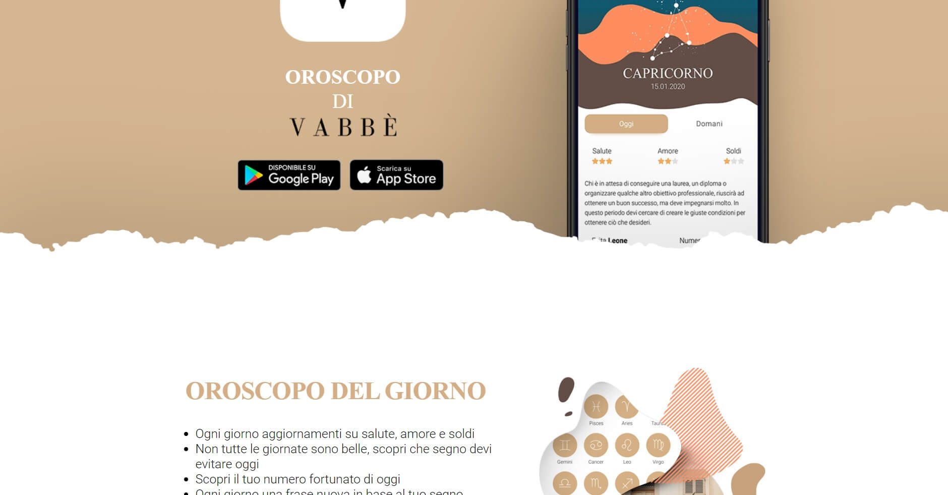
This example from Oroscopo shows how the sections look like they’ve been torn apart. The trend of using contrasting colours of blobs and waves within transitions.
The transition may be so distinctive that it becomes disruptive, throwing viewers off guard with an unexpected visual of a striking transition.
The next portion of content is irrelevant until your viewer decides to scroll down for more; seeing the start of an interesting and interactive continuity of the next transition as they scroll through is a motivation to continue scrolling.

Our frank advice? Don’t be too distracting. There’s a difference between simple and plain designs. You want to keep it simple and easy, but you want it to be visually engaging and impressive.
Use dynamic transitions sparingly without overshadowing your content and other page designs. Overuse could cause confusion, distraction, or worse still, wear your visitors thin with excessive visuals before they can get to the important content.
Masonry Layouts
Masonry layouts are an emerging popularity in web design galleries and web structures. Think Pinterest and Instagram. Pictures uploaded on their platforms are positioned to look more even, modern and spacious in orientation.

The reason why this layout is so effective is because it keeps your website elements in place and aligned, in a clean and neat way – characteristic of a modern professional website.
Your elements and information will be easier for visitors to locate and your website’s viewer-friendliness will be inviting and comfortable to navigate through.

For a bonus, you can implement a light box effect into your galleries, which means your pictures will be clickable and magnified upon click. This makes the galleries on all your pages more interactive and allows visitors to view your pictures in their full glory.
Shapes & Lines
Shapes are a great way of catching eyes when your visitor lands on your website. Triangles, rectangles, squares, shapes of any number of sides, are so distinctive in their simple, regular forms that they make the messages they encapsulate just as clear and straightforward.

Yet, it’s because they’re simple enough that they don’t take attention away from the main content. They’re the perfect background accompaniment to your web design, or the perfect eyeshadow to make your designs pop.

Geometric shapes and borders bring such a strong focus that they underscore the directive of the website. We’ve also found them equally prominent and powerful in social media, making it a practice to incorporate borders in most of our posts.
Personalised Website UX
If you have a website, you’ve most probably heard of user experience, more commonly known as UX. And you know it’s important. The aim of UX is to base its design on your understanding of your target audience. But how deep does UX go?
Every website is definitely designed with some form of UX in mind, so what is it about focusing more on UX that makes things any different? Well, a high level of UX takes into account the personalisation of a product, service, or in this case, a website, to as many users as possible.
Everything about your target audience is researched and analysed – interest, preference, gender, age, and how each group generally navigates through your website.
While it’s true that it’s part of a web designer’s job to create websites based on UX, many projects don’t go into details when designing the actual roadmap of your visitor’s journey.
For example, a website that provides sitting services for pets might primarily cater to pet owners seeking dog boarding, dog walking and, perhaps, even house-sitting services.

A UX designer would look at each of these groups, observe their interests and concerns, talk to them about their priorities, etc.
Following that, the designer would see that the homepage captures the trust and attention of these groups of audiences, with different parts of the websites accommodating to each group’s specific needs.
The words used, the structure of the content and advice/resources provided would differ across the website.

Personalisation of this level tells your main consumers you are thinking about them, catering to them and taking the time to understand their point of view.
However, take note not to overload your website with unnecessary content and illustrations. One mistake designers make is to try and overcompensate by jamming as much information and styles into their website as they can to satisfy every group of viewers.
Be selective and precise about managing your target audience. Once you do that, only can you start researching and creating effective user experiences.
in Summary
These are all our recommended web trends to follow – going strong from 2019 to new emerging styles in 2020. These tips we’ve curated are simple to follow and understand. Even if you’re not a web designer, these are important trends to know to stay ahead of the competition.
Need help with your website? Just contact us here. If you’d like to elevate your website to get even more traffic and conversions, be sure to view our web design service!


